BRIEF.
Based in San Francisco, a renowned private chef to high-profile clients launched a new platform to help up and coming talented chefs fulfil their true potential.
The new platform would make hiring a chef accessible and simple pairing talented and ambitious chefs with high-performing individuals, busy families and food-lovers.
The objective was to create a logo and visual brand identity for Concentriq to introduce the new platform to potential employers and candidates.
SOLUTION.
The logo concept explores helping both chefs and employers reach their true potential. This is manifest as a pathway: 'The concentriq pathway to true potential.'
This theme is also present in the design of brand visual elements such as icons and motifs used across digital and print media.
The colour scheme celebrates the vibrancy of ingredients. I developed a core brand colour way and a colour system that works in synergy with imagery to create a dynamic brand look and feel.
RESULT.
A fresh and vibrant brand with impact. The bold visual palette of colour and imagery work together to present a clean and fresh style, inspiring confidence and excitement to both candidates and employers.


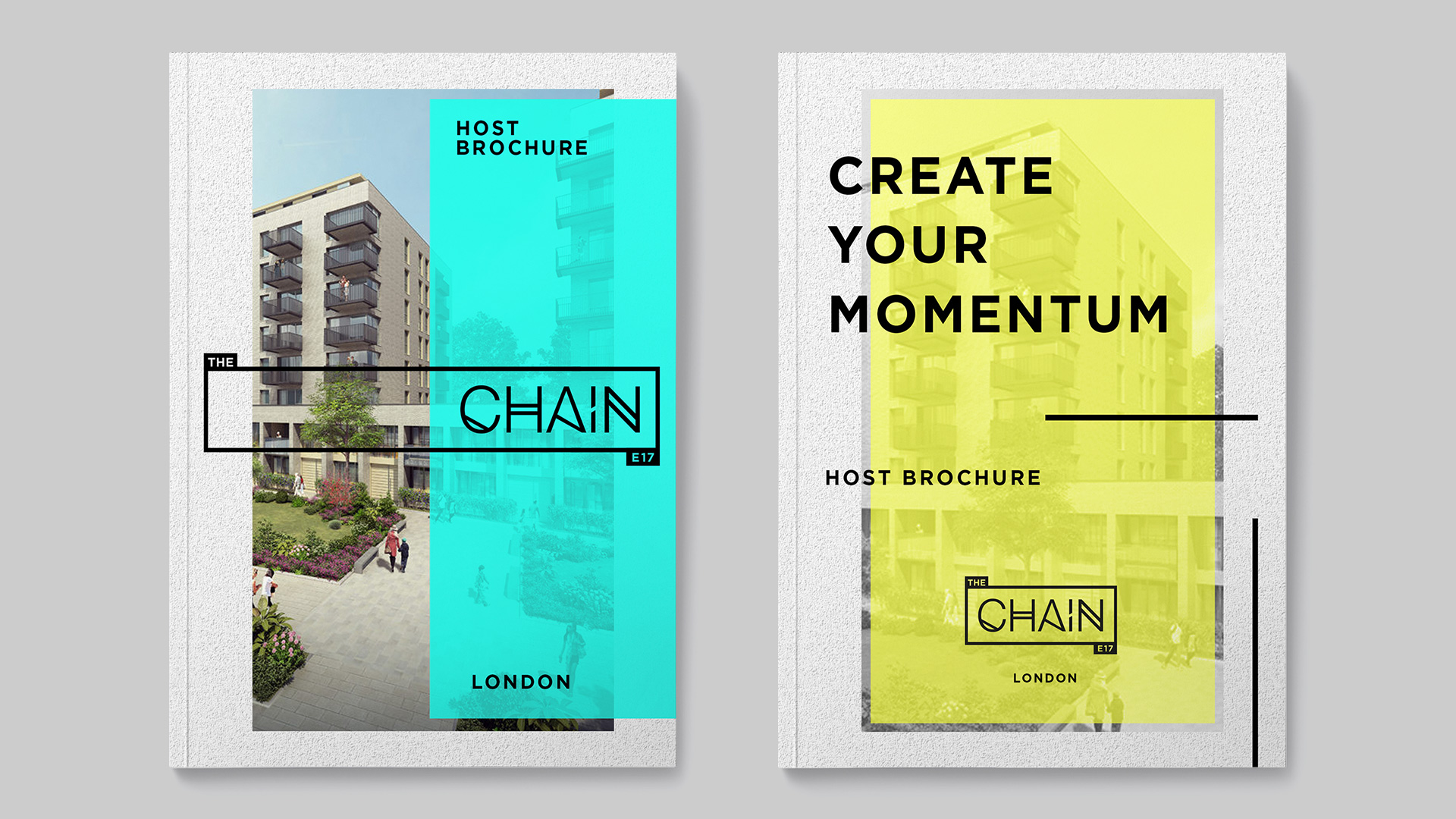
A print brochure was also designed to offer a more tactile experience. This was an opportunity to showcase a more rich and vibrant presentation to tantalise new candidates and employers.
Colour works in synergy with imagery to create a bright and dynamic brand look and feel.


On this project I was able to learn more about colour systems and how they can work with imagery to create a sophisticated brand approach.
I learnt a lot on this project which I look forward to incorporating in further work.