

BRIEF.
L&Q group were granted planning permission for 473 new homes at the Southgrove site Walthamstow town centre in 2017. The plan also includes 2,786 square meters for a new public and commercial space which is hoped to become a cycle cafe. Construction began in early 2018 and is expected to be completed in 2020.
The objective was to create a marketing name, block and street names for the development and a visual identity to inspire new residents to the up and coming area of E17 London.
SOLUTION.
I established a concept that offers a unique connection to Walthamstow celebrating the enthusiasm for cycling in the borough, the up and coming integration of new cycle paths and a planned onsite cycle cafe.
We wanted to create a sense of freedom, proactivity and healthy living around the theme of cycling whilst also promoting the idea of togetherness and connection we want to encourage in the community.
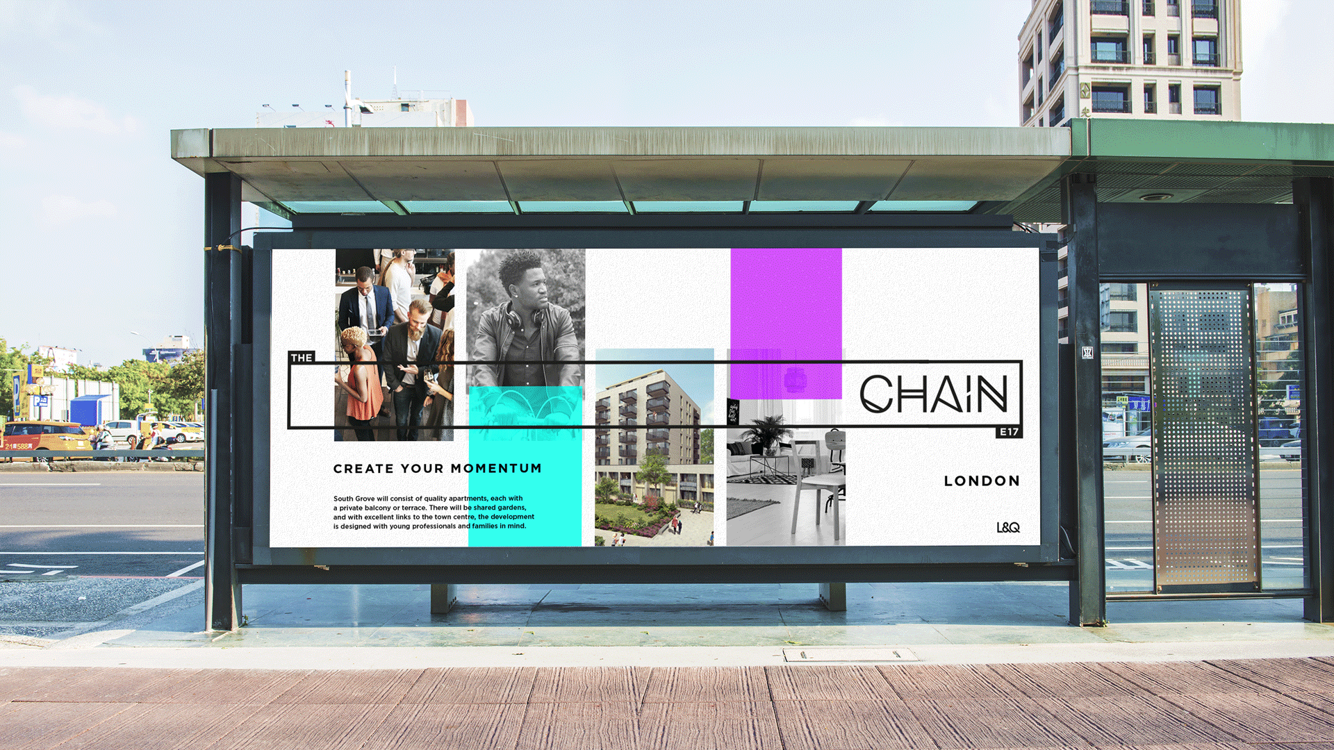
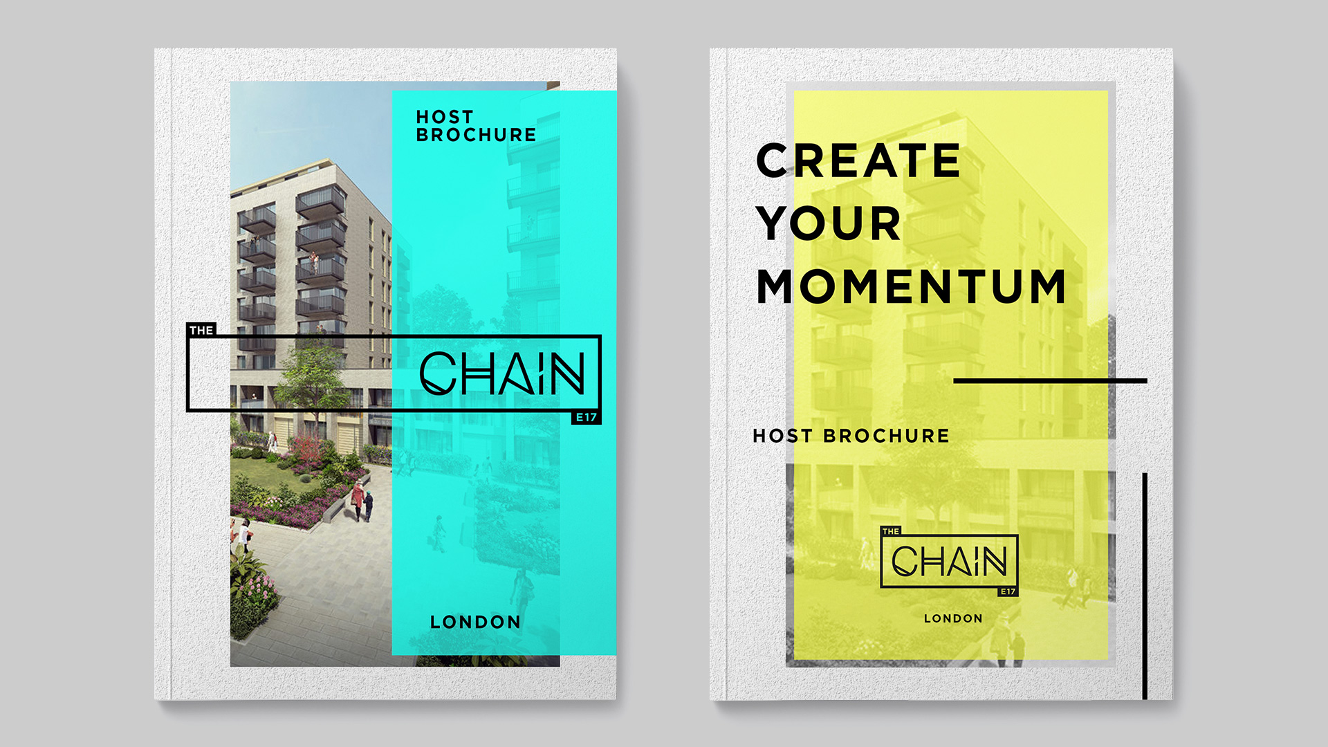
The site will be named ‘The Chain’. The blocks, buildings and streets are named with cycle and urban cycling themes.
RESULT.
A contemporary property-marketing campaign including a logo identity and visual brand that is both bold and dynamic. Designed to appeal to young professionals and families the brand embodies the edgy urban vibe unique to East London.
The visual palette works together to build a vision of aspiration, a life that can be lived at The Chain.
Marketing creative included design across both print and digital for stationery, brochure layout, street hoarding and marketing media collateral such as design for the website and print advertisements.

VARIATION.
The project initially required desk and field research, brainstorming and pitch work for a marketing name, block and street names for the development.
I established a concept that offers a unique connection to Walthamstow celebrating the enthusiasm for cycling in the borough, the up and coming integration of new cycle paths and a planned onsite cycle cafe.


I was responsible for delivering on the entire scope of this project. I particularly enjoyed the challenge and process of coming up with the name for the residential site, developing the logo identity, executing a thorough brand solution across print and digital collateral, and producing brand guidelines.
Taking on this level of responsibility proved that I am able to manage and deliver on demanding projects.
In my experience I have worked on a few property marketing campaigns, and would like to be involved in more in future.


