BRIEF.
Initially the objective was to undertake research & design to put forward ideas to name a new remittance app for the India market.
Once the name was chosen I was then tasked to design the app logo and visual identity for the app experience.
The logo would need to represent and symbolise the initiative of the digital app and appeal to a new generation of remittance.
SOLUTION.
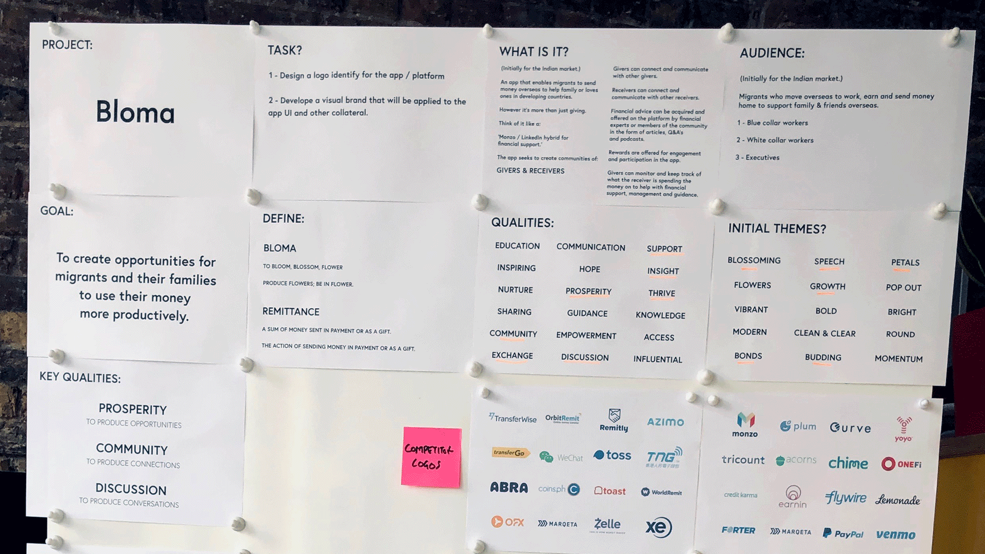
A name that embraces the idea that the platform helps friends, family and the community blossom from the platform offering important advice to help improve finances.
‘Bloma’
The wordmark logo brings together the 2 key aspects of the app.
Communication & growth.
The logo embodies the conversation and growth (blossom) element of the app experience.
RESULT.
A visual brand that creates a bright, uplifting and fresh user experience that breaks the norm for financial platforms.
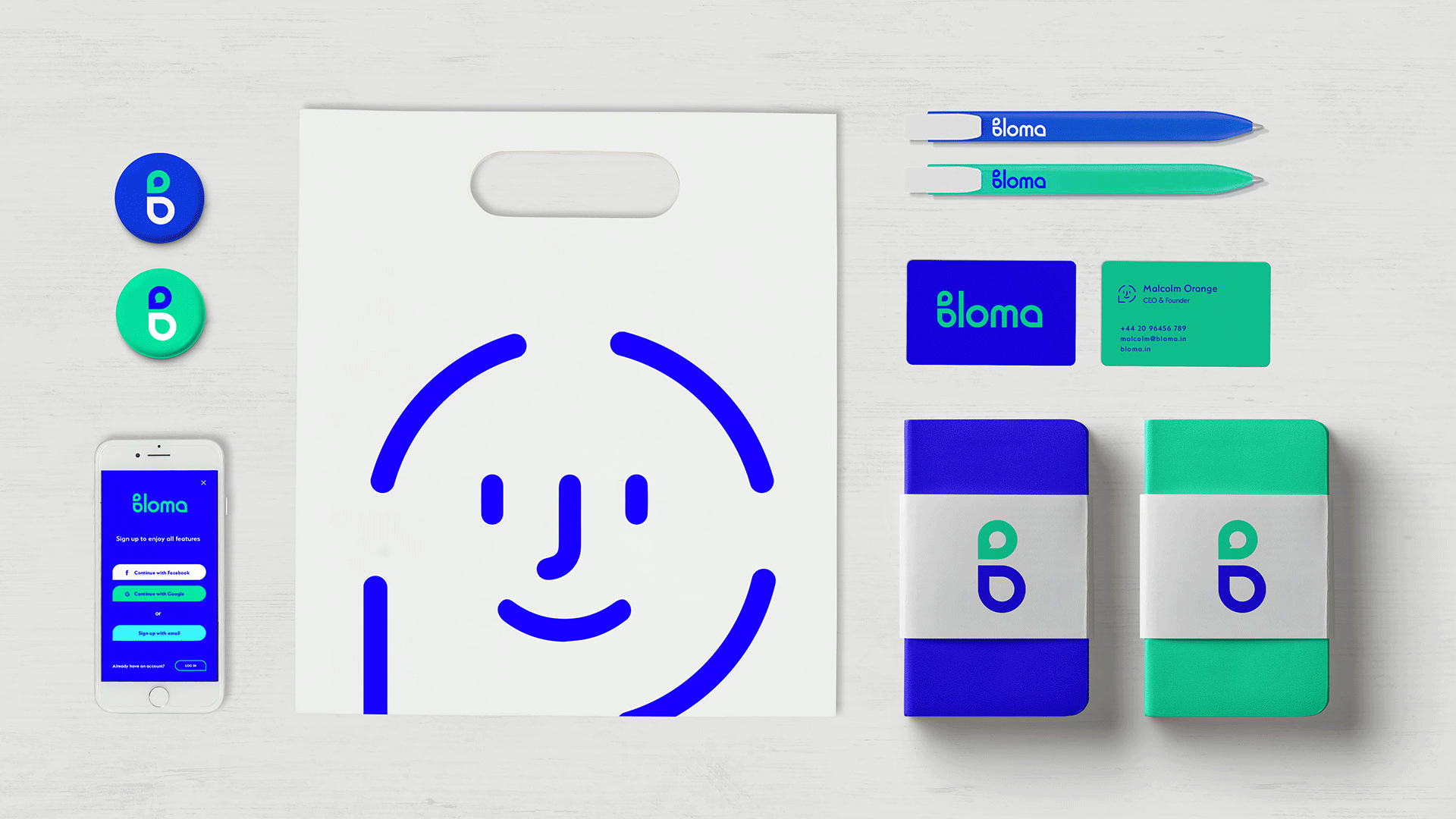


CUSTOM ICONOGRAPHY.
For the Bloma brand I crafted an extensive range of bespoke icons and an illustration style which would be used both in the app and as part of the brand look and feel.


CONCEPT DESIGN.
I wanted the logo to reflect on the growth, community and discussion element of the app experience.
During the discovery phase I found that a speech bubble and a petal can look similar.


One of my favourite things to do when designing for logo identity is to create design solutions that don't explain, but rather personify the subject matter.
I always strive to capture the spirit and essence in a strong visual solution because this always guarantees a strong meaning in my work.
I was particularly happy with the result on this project as I feel it accomplished this task well.

Lorem ipsum dolor sit amet, consectetur adipiscing elit. Integer condimentum vulputate quam et pellentesque. Integer massa nisi, faucibus et viverra a, ultrices cursus purus.
dfdfdfd
fd
fd
fd
fd
fd
fd
d
fd
fd
Lorem ipsum dolor sit amet, consectetur adipiscing elit. Integer condimentum vulputate quam et pellentesque. Integer massa nisi, faucibus et viverra a, ultrices cursus purus.
dfdfdfd
fd
fd
fd
fd
fd
fd
d
fd
fd