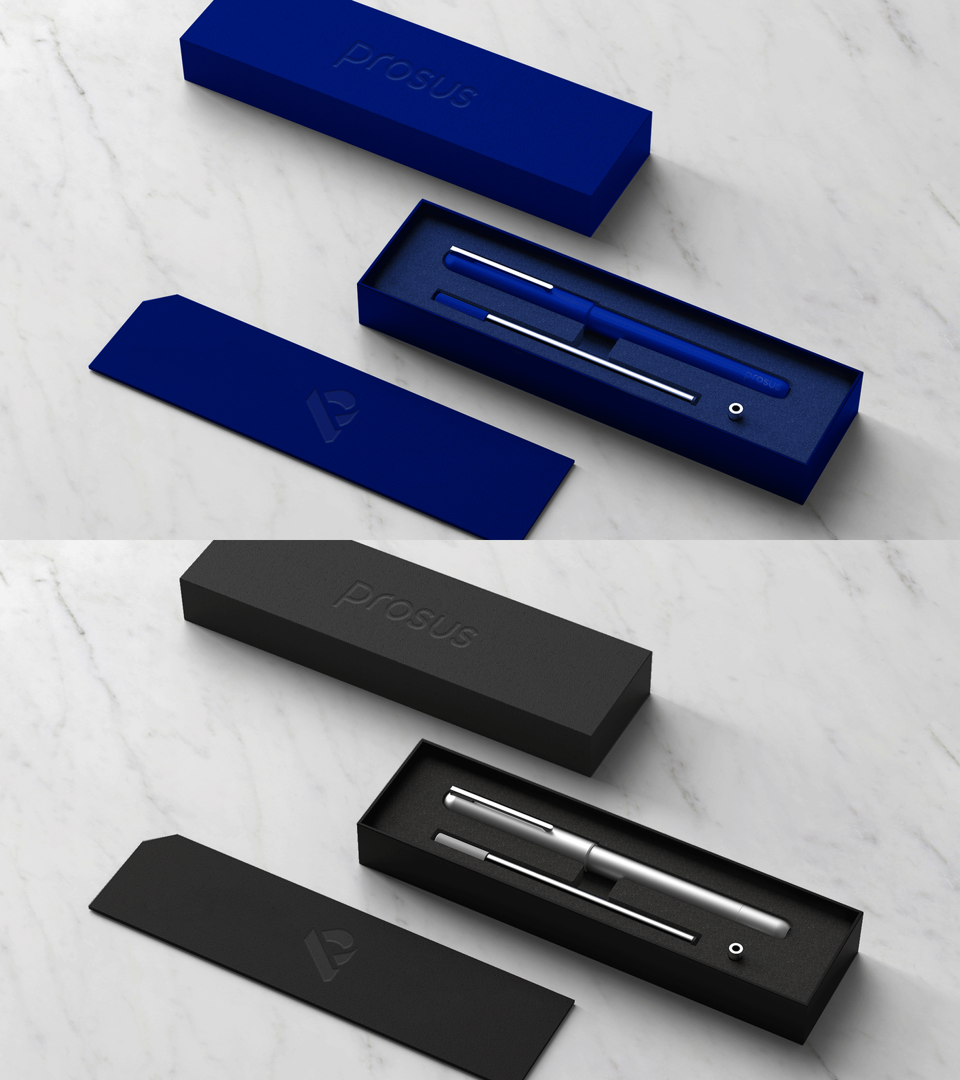


BRIEF.
Prosus is a global online technology investment company and is europe’s largest listed consumer Internet company by asset value, Prosus gives global Internet investors direct access a unique and attractive portfolio of international internet assets.
The objective was to develop a unique, distinct and contemporary brand including a new logo identity.
SOLUTION.
A logo concept that symbolises how the company elevates tech companies to new heights.
This is demonstrated in the 3D form of the logomark, which rises out of negative space to form a tangible letterform backed up with a carefully crafted wordmark.
This theme is also present in the design of brand visual elements such as icons and motifs used across digital and print media.
RESULT.
An iconic, ownable and memorable logo identity - with a positive, modern and tech feel which stands confidently among other big tech players in the industry.
The client really liked the simple iconic aesthetic of the logomark and how I was able to capture their values in the mark. They also liked the flexibility the logo system offered.

BRINGING A CONCEPT TO LIFE.
I wanted the logo to personify the force of elevation. To achieve this I created an isometric logo which created a nice 3D profile which made the ‘P’ feel tall and strong.
To bring the concept to life even further I was able to incorporate animation into the logo design.


COLOUR CHOICE.
For Prosus we wanted to emphasize simplicity and confidence. Blue was a favourite colour of the organisation and it also allowed the logo to stand out amongst its competitors.
I proposed using high contrast between blue and white as the hero colour scheme, and offered a black and white option to be used for variety.


CUSTOM ICONOGRAPHY.
As part of the brief, Prosus required a series of icons they could use in their presentations.
For Prosus I crafted an extensive range of bespoke icons which would be used as part of presentations and brand collateral.


CONCEPT DISCOVERY.
I started by learning as much about the company as possible, learning about their philosophy, work ethic and goals looking for interesting aspects that would inspire possible creative solutions.
I was able to identify five key qualities about prosus which I thought would be interesting to bring to the surface and reflect in the logo somehow.


ARTWORK & DESIGN.
I took my sketches and worked them up on the computer to develop the logos further, applying colour and refining the shape and form.
Once prepared I presented the initial logo designs clearly to the team to discuss possible developments and discuss which idea we thought worked best.


CHOSEN DESIGN.
Prosus is all about investing in new Tech companies. They enable tech companies to flourish and overcome the initial financial struggles.
For one of the routes I wanted the logomark to personify the force of elevation, they power they bring to new business. I felt this would portray the qualities of the company well.
To achieve this I created an isometric logomark which created a nice 3D profile which made the ‘P’ feel tall and strong. To go with this I crafted a word mark which allowed them the flexibility to use it as a combination lock up, or as separate pieces.
This was the clients favourite design. The client really liked the simple iconic aesthetic of the logomark and how I was able to capture their values in the mark. They also liked the flexibility the logo system offered.
When I create logo designs, I always start by learning as much about the subject matter as I can. I like to search and uncover gems that I can use as inspiration to base visual solutions around.
I always find clients respond really well to this, as it shows I have thought a lot about their product and it gives meaning to their design.

Lorem ipsum dolor sit amet, consectetur adipiscing elit. Integer condimentum vulputate quam et pellentesque. Integer massa nisi, faucibus et viverra a, ultrices cursus purus.
dfdfdfd
fd
fd
fd
fd
fd
fd
d
fd
fd
Lorem ipsum dolor sit amet, consectetur adipiscing elit. Integer condimentum vulputate quam et pellentesque. Integer massa nisi, faucibus et viverra a, ultrices cursus purus.
dfdfdfd
fd
fd
fd
fd
fd
fd
d
fd
fd