BRIEF.
Based in Shoreditch London, the Atlas Building epitomises luxury-living in an exciting and vibrant urban landscape. Standing tall with 38 residential floors of exquisite apartments, Atlas stretches across London’s prominent skyline.
At its base is a retail space. The objective was to create a logo and visual brand identity for a marketing strategy to introduce the retail space to potential business with the aim to generate viewings.
SOLUTION.
The concept explores the building blocks that create a rich and diverse community in and around Shoreditch.
The logo identity and visual brand expresses this in an abstract nature, with an edgy contemporary style, suggesting construction and building, focusing on the pieces that bring it all together.
RESULT.
A distinct and provoking retail-marketing campaign designed to represent one of the most vibrant neighbourhoods of London.
The visual palette of colour and texture work together to build an edgy, aspirational workspace proportion to contemporary business.
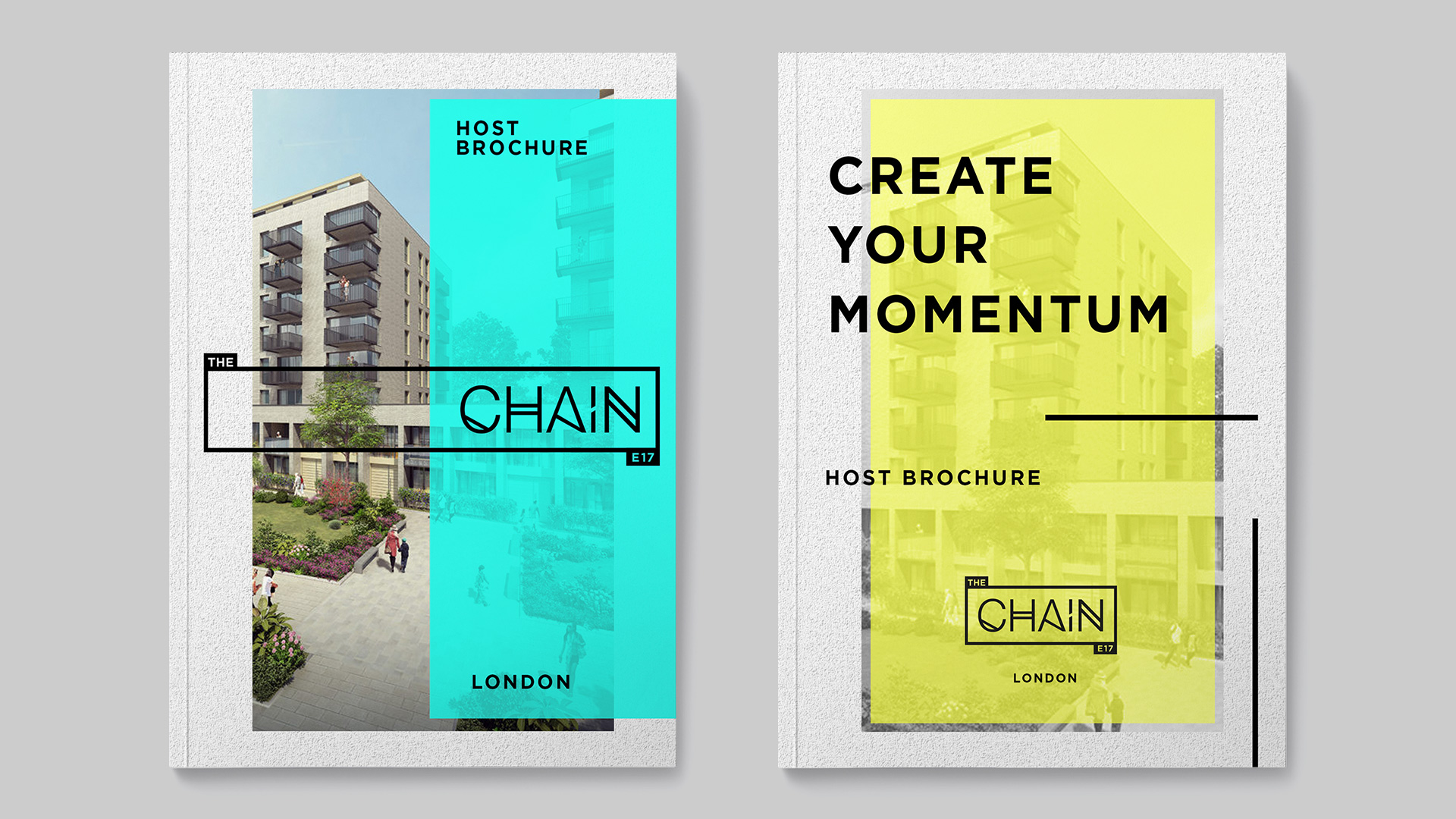
Marketing creative included design across print in a brochure layout.


When the logo is used in a larger decorative context the building blocks of the logo can be filled with image and texture to further celebrate the idea behind the logo identity.

RESPONSIVE DESIGN.
Colour is determined by the media it is placed with. For example when used with images the logo can pick out colours from that environment. This creates a logo system with a diverse and vibrant potential.

MIX & REVEAL.
The brochure is designed in a format to create an interesting experience and inspire potential retailers.
The brochure consists of pages in various sizes which work to mix and reveal, juxtaposing various textures, styles and lifestyle environments together, triggering the imagination.

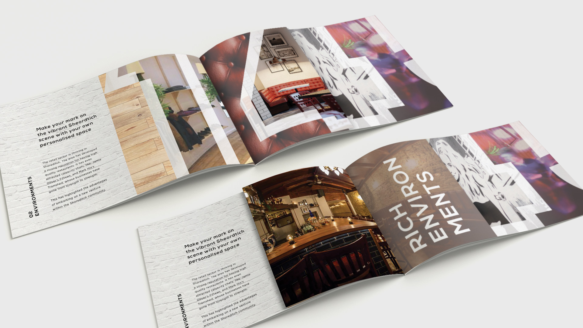
This became the design principle throughout the campaign, used on posters, brochures and advertisements.