BRIEF.
Zellar is a new and revolutionary software platform changing the way small business pay for their energy. Zellar offers small business savings by helping them go direct instead of using brokers.
This project was more than a branding exercise. We had to educate small business of a new paradigm of energy consumption, a change in the culture of buying energy that puts small business first and builds everything around them.
We needed to help and inspire small businesses to see the light on the current status quo and take action to become changemakers.
The objective was to develop a contemporary logo identity and build a brand that would help the new software platform stand out and to communicate and inspire change.
The logo would need to represent and symbolise this initiative to inspire change.
SOLUTION.
The logo concept symbolises the energy and positive force that the company brings to small business.
This is demonstrated in an organic wave, which releases its light and energy across the platform.
This theme is present throughout the design of the visual elements such as icons and motifs used across digital and print media.
RESULT.
The result is a fresh logo and a bright energetic brand ready to change the culture of energy consumption for small companies around the world.

CREATING ENERGY IN A LOGO.
I wanted the logo to embody the human and vibrant values that Zellar holds prominent.
The shape in essence is an organic wave, bringing customers information, revealing and delivering the right information.
The light wave creates movement which projects a dynamic and vibrant theme that will captivate and engage customers.
All boiled down into this simple light wave, this sets an ownable shape, movement and philosophy, the embodiment of Zellar.

The Zellar logo has been designed with specific permutations which give it flexibility to be used appropriately in a formal or a more adventurous context.
The Zellar logo can be used with just the wave logomark, the simple wordmark, or the complete lock up.


CUSTOM ICONOGRAPHY.
For the Zellar brand I crafted an extensive range of bespoke icons which would be used for presentations.


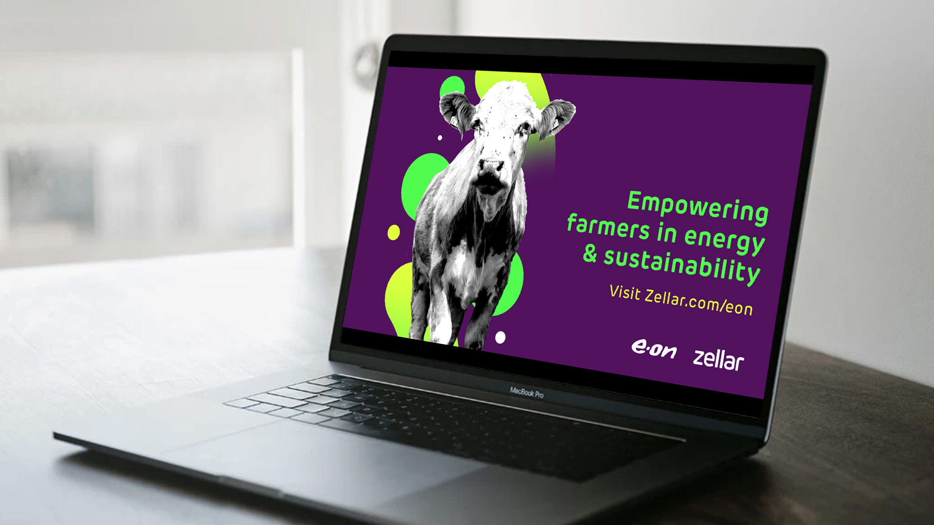
As part of a broader marketing and promotion strategy I developed a fun graphic art style used to reflect on the exciting projects Zellar are involved in and then small business they work with.
This is be used to portray an aspirational outlook which can be used in social media and for presentations.


VARIATION.
I started by learning as much about Zellar as possible, learning about their philosophy, work ethic and goals looking for interesting aspects that would inspire possible creative solutions.
I was able to identify some key qualities which I thought would be interesting to explore and and reflect in the logo somehow.


VARIATION.
Lorem ipsum dolor sit amet, consectetur adipiscing elit. Integer condimentum vulputate quam et pellentesque. Integer massa nisi, faucibus et viverra a, ultrices cursus purus.

PRESENTATION ROUND 1
Once I had developed my sketches into more refined examples I prepared a showcase to present to board members.
Here we discussed possible developments and which idea we thought worked best.

PRESENTATION ROUND 2
After refining the three select routes and working them into some example brand contents I presented the work to choose a route option.

CHOSEN DESIGN.
Zellar is about helping small businesses thrive with their simple and easy service.
For one of my designs I wanted the logo to project a dynamic and vibrant theme to reflect this.
I also wanted to create a flexible logo system where the logo can be used appropriately in a formal or a more adventurous context.
In its simplest form the logo exists as a wordmark, based on a the Rubrik Edge New typeface which was designed to express how tech is made simple and easy.
In its adventurous form the logo combines with the light wave as a hybrid lockup.
The wave was the clients favourite design. The client liked the wordmark and energy and the freshness in the lockup design.
They thought it was a contemporary design for a contemporary tech company and felt it represented the company well.
For this project I worked at a small start up where I had the responsibility of leading the creative process and consulting on creative brand strategy.
This was another great opportunity for me to gain experience and harness my creative direction skills and also build on my design marketing skills.
This is exactly the type of work which best fits my abilities and what I will seek out in future.

Lorem ipsum dolor sit amet, consectetur adipiscing elit. Integer condimentum vulputate quam et pellentesque. Integer massa nisi, faucibus et viverra a, ultrices cursus purus.
dfdfdfd
fd
fd
fd
fd
fd
fd
d
fd
fd
Lorem ipsum dolor sit amet, consectetur adipiscing elit. Integer condimentum vulputate quam et pellentesque. Integer massa nisi, faucibus et viverra a, ultrices cursus purus.
dfdfdfd
fd
fd
fd
fd
fd
fd
d
fd
fd